Head InsideBrand Identity

Brand & Identity Studio
A Brisbane studio shaping brands, typography and visual systems for people who'd rather not blend in.
The Studio
Loose Design is an independent brand practice. The work runs from logomarks and wordmarks to full identity systems — built on careful type, considered structure, and a bias toward marks that age well.
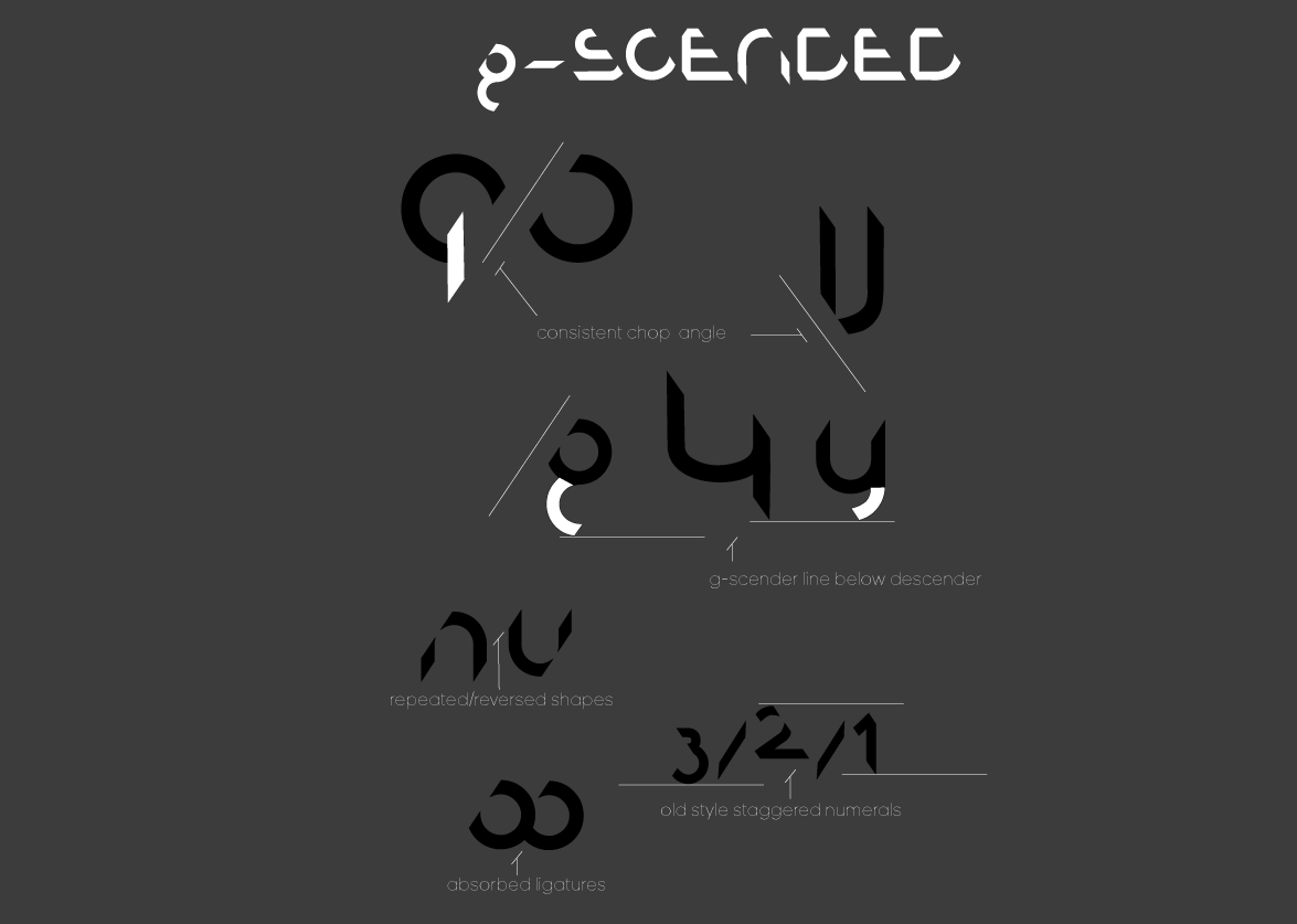
Every project starts with the letterforms. The rest follows.
Selected Work
Case Studies
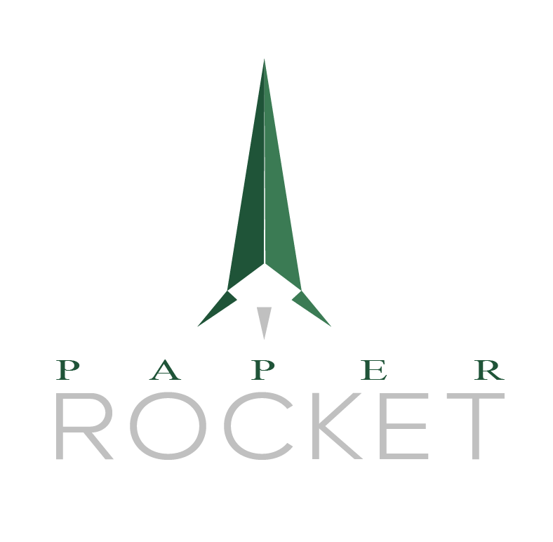
Paper Rocket
Paper Rocket is an Australian business transaction intelligence company — it produces the information memoranda, competitive analysis and revenue models behind business sales. The identity had to read as precise and quietly authoritative: a brand that looks like a well-typeset annual report, not a startup.
We built the full system — logo, typographic rules, colour, clearspace and grid — then carried it into an interactive brand kit, a print-ready specification, and a pre-launch site that behaves like a financial document assembling itself on screen.
Times New Roman small caps, wide tracking — paired with Causten Light for the wordmark.
Reach
The Designer
Founder & Creative Director
John runs Loose Design as a one-desk studio — the person you brief is the person who draws the marks. The practice grew out of a stubborn interest in letterforms and the belief that a brand lives or dies on its type.
The approach is hands-on and unhurried: fewer projects, closer attention, and an identity that's built to outlast the trend cycle. No account managers, no relayed feedback — just direct work.
Start a conversation →Start a project